A CORPORATE IDENTITY CAN SAY A LOT ABOUT YOUR COMPANY’S PERSONALITY AND VALUES
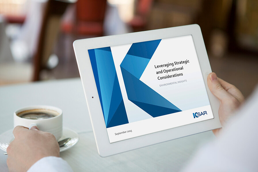
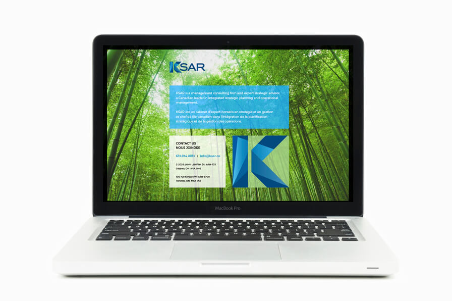
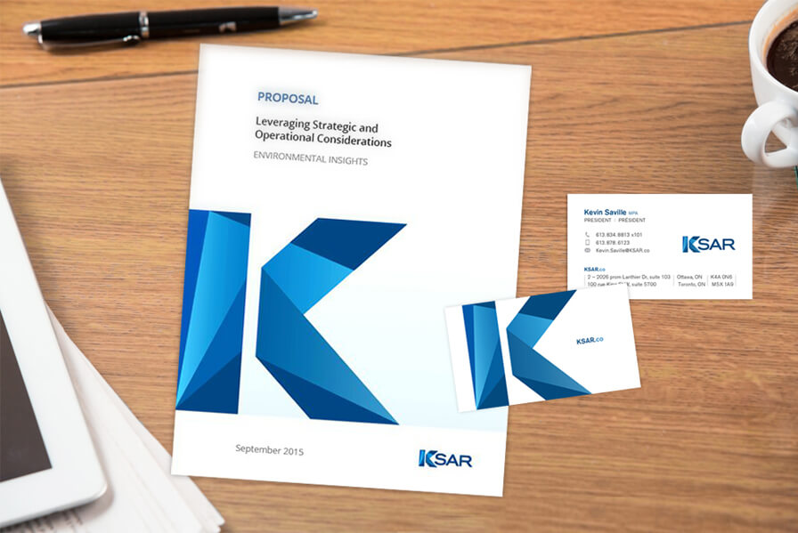
Kevin Saville, President of KSAR & Associates, approached us to do a redesign of the KSAR logo and then develop corporate stationary, a power point template and an infographic with the new look.
The new identity had to immediately say “professional”. But, Kevin also wanted the logo to be bold yet conservative and project strength and confidence. The “K” in KSAR was zeroed in on as a potential prominent feature in the new design.

Working closely with Kevin, we developed a smart and sophisticated design that featured the K front and centre. The design was contemporary in tone but at the same time evoked a highly professional and conservative ethos.
The new logo, stationary and collateral hit the mark. KSAR’s updated corporate identity meshed perfectly with its core business of helping organizations across public and private sectors to shape and implement strategic decisions and initiatives.


IS YOUR LOGO IN NEED OF A REDESIGN?
Send us your logo and we’ll give you our honest oppinion.


Sorry, the comment form is closed at this time.